Leading the strategy for NIUs for Google Maps
From notifications to content systems—aligning digital information with real-world context for new-internet users on Maps.
From notifications to content systems
This work sits on the next layer of how people use the internet in India: not long browsing sessions, but short, repeated moments where a phone is checked many times a day and most sessions end in under half a minute. The design question is how Maps can meet new-internet users (NIUs) in those moments with context that feels grounded in the real world, not abstract product chrome.
What if notifications weren’t alerts, but decisions made for the user? In hyperlocal ecosystems, relevance isn’t discovered — it’s delivered.
System context
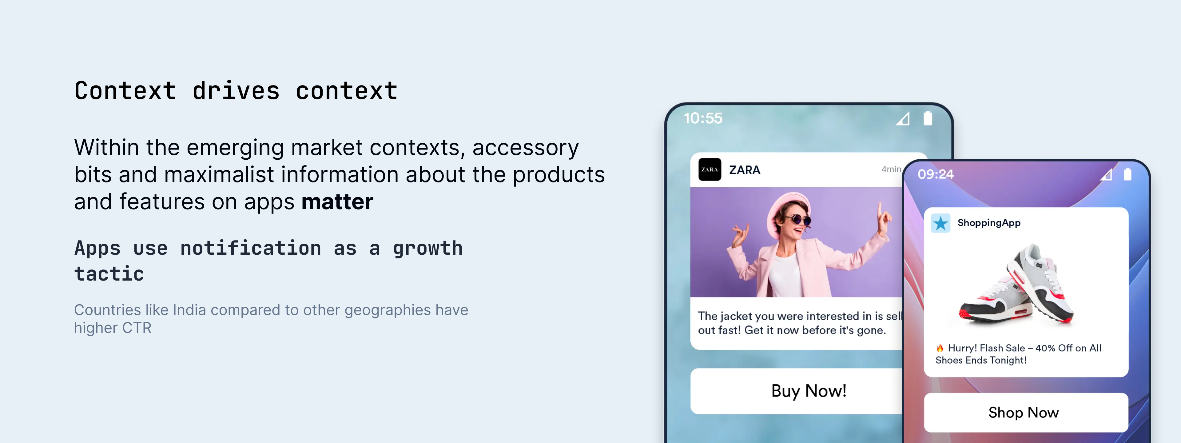
Among NLIs, notifications are often the main path to learning what an app can do. In India, many products lean on notifications as a growth surface, and engagement patterns can look different than in other markets—for example, notification CTRs are often higher in India than in the US. Messaging apps also carry a large share of how information moves day to day.
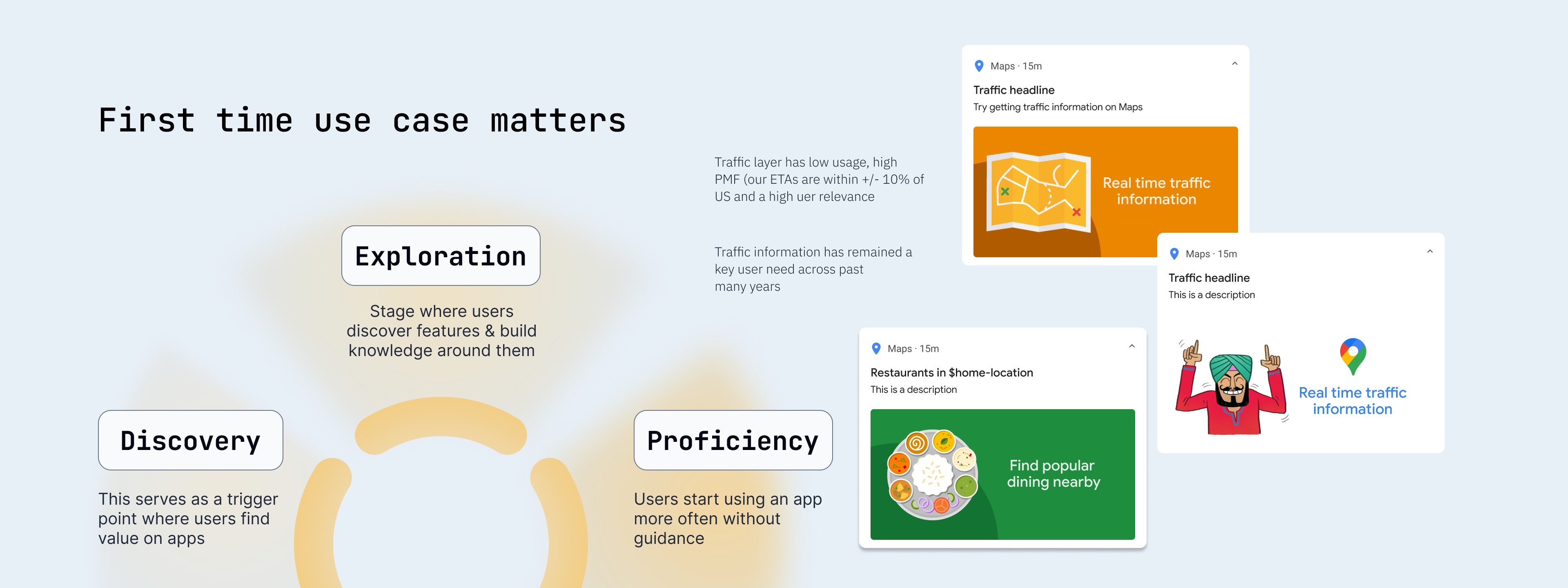
For NIUs, the path from first onboarding to steady use is rarely a straight line. The first session with Maps is decisive: it either builds enough confidence to explore, or friction shows up early and people leave before they ever see the value buried deeper in the product. Without prior habits around digital maps, the learning curve can feel steep quickly, and high-value features risk feeling too complex too soon.
The implication is simple to state and hard to execute: you do not optimize for open-ended exploration first. You optimize for instant comprehension and a clear next action.
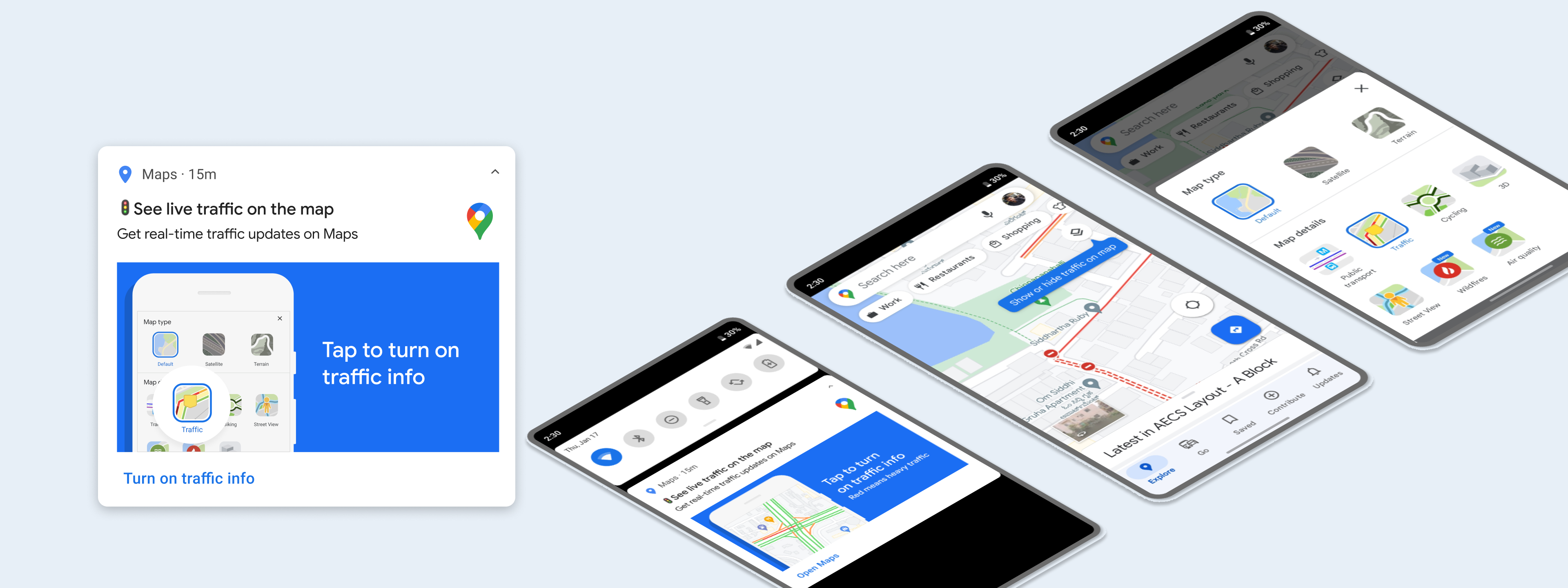
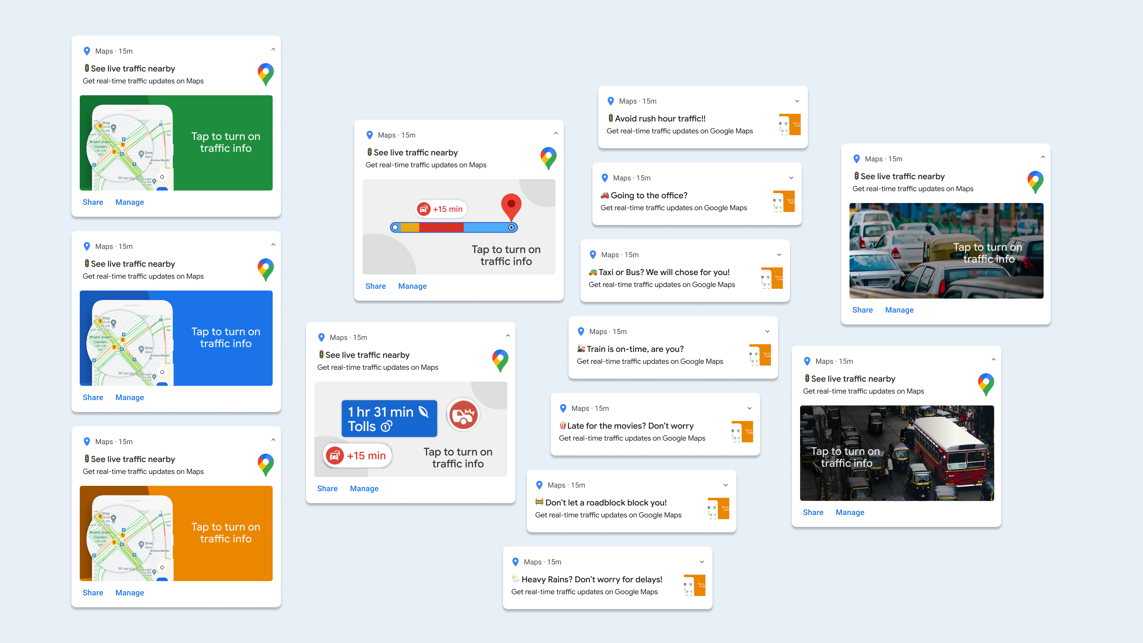
Notification strategy
Notifications are entry points, not a separate “feature lane.” If the entry point fails, the rest of the UI barely gets a chance. The shift we framed was from event-style alerts to context-aware triggers that respect why now.
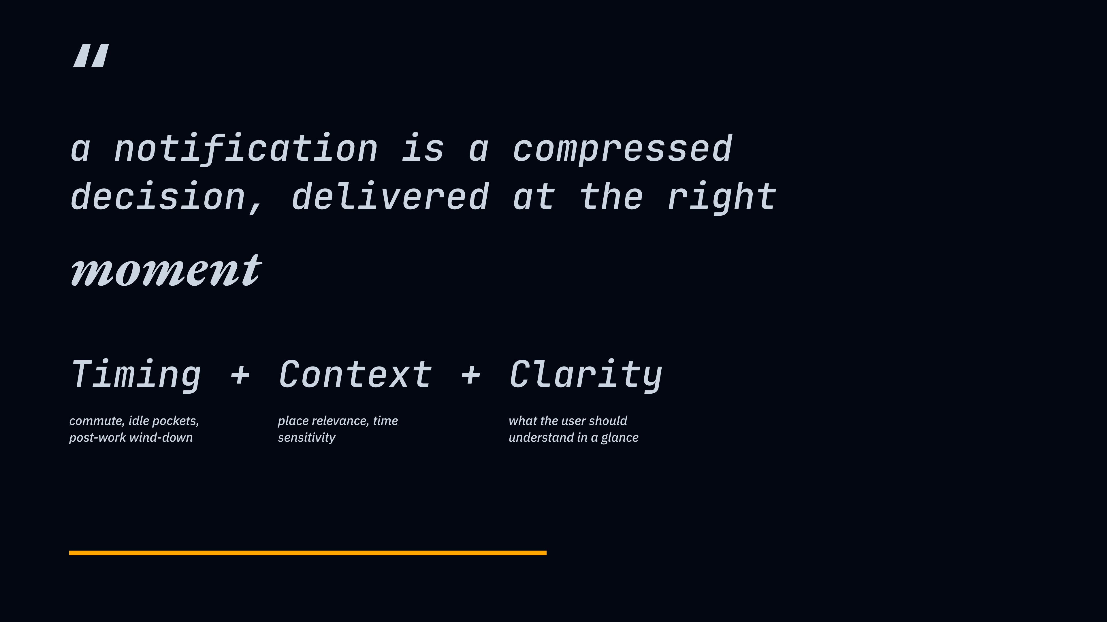
The framework stayed intentionally small. Timing asks when interruption is tolerable (commute, idle pockets, post-work wind-down). Context asks why the moment matters (place relevance, time sensitivity). Clarity asks what the user should understand in a glance—roughly a two-second scan—before they decide to tap or dismiss. In one line: a notification is a compressed decision, delivered at the right moment.
Conceptual work focused on the gap between today’s notification patterns and a system that could carry real-world context into that first touch—without turning the channel into noise.
Hyperlocal content system
People do not “read a feed” the way a dashboard assumes. They continuously evaluate relevance—fast, skeptical, and situational. When the system respects that, the qualitative goal is straightforward: less time spent decoding, more time spent on what matters.
Design directions for mocks included near-you prioritization, distance and time on the surface of a card, a clear way to show live or ongoing events, and lightweight social signals (activity, comments) that help ranking feel human without becoming noisy.