Mainframe Assessment Tool
I inherited a fuzzy, high‑complexity product picture and turned it into a clear plan we could ship—then grew the work from two journeys to six, with room for AI helpers on top.
What this work was about
Mainframe Assessment Tool (MAT) was hard to explain because the real system is huge and old. My job was to cut through the noise: make the product legible for people who need to decide, not just admire diagrams.
The barrier
Modernizing a mainframe stack is so heavy that teams stall. Without a shared picture, every meeting replays the same fears instead of moving work forward.
Taking the program on
The effort had many ideas pulling in different directions. I stepped in when a senior staff designer left and ran design end to end—from framing to delivery—so the program did not lose a year re‑negotiating “what MAT is.”
In about eight weeks, that work settled into a framework we could ship: priorities, patterns, and language the whole team could reuse.
The question behind the UI
Most of the risk sits under the waterline: years of dependencies, exceptions, and habits nobody wrote down. How do you show decades of legacy so a developer today can migrate without guessing?
That is not a chart problem. It is a trust problem. The interface had to respect how big the iceberg really is.
To explain that trust chain to stakeholders, we used a plain-world parallel: a withdrawal at a branch. It is familiar, sequential, and every step has a clear owner—much easier to reason about than “the mainframe” in the abstract.
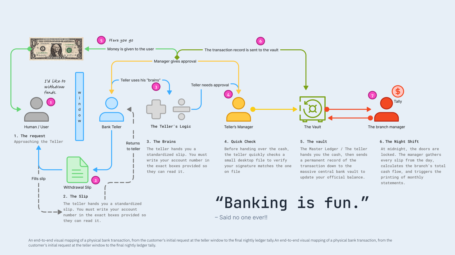
End-to-end map of a physical withdrawal: who asks, who formats the request, who checks it, and where the record finally lives.
You are the customer with a simple intent: I want my money. The teller is the product surface—friendly, bounded, trained. The teller’s “brains” are the quick checks: signature on file, rules, exceptions. The manager is governance when the case is unusual. The vault is the system of record: the balance that actually matters after the day is done. The night shift is the slow truth—batch tally, statements, the ledger catching up so tomorrow starts clean.
That is the same shape as assessment: a standardized slip (structured inputs), visible checks (signals vs guesses), escalation when risk spikes, and a durable record so engineering and finance agree on what happened.
Same story with roles named: who holds the intent, who applies judgment, and where authority and memory split.
Scope grew from two journeys to six, each owned end to end:
- Overview
- Discovery
- AI insights
- Settings
- Reports
- Filtering
“We went from a few scattered flows to one story we could walk customers through. That made reviews and builds calmer for everyone.”
— Senior developer, team lead
Approach
Idea: Work one resource at a time. The diagram shows the shape; clicking a node opens a small IDE-style panel for that item.
Gen AI suggests application clusters and pre-fills fields. You review and edit—nothing ships on auto-pilot.
Prompt we kept repeating: IDE + node diagram + Gemini — on one screen.
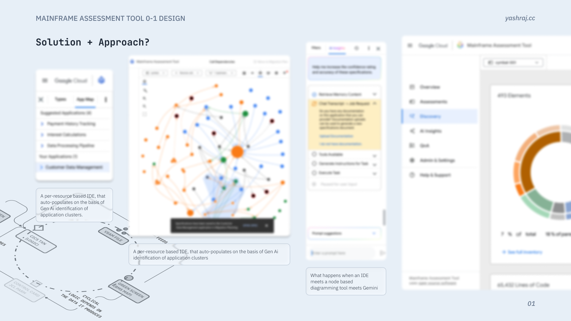
Mock UI, not a shipping screen.
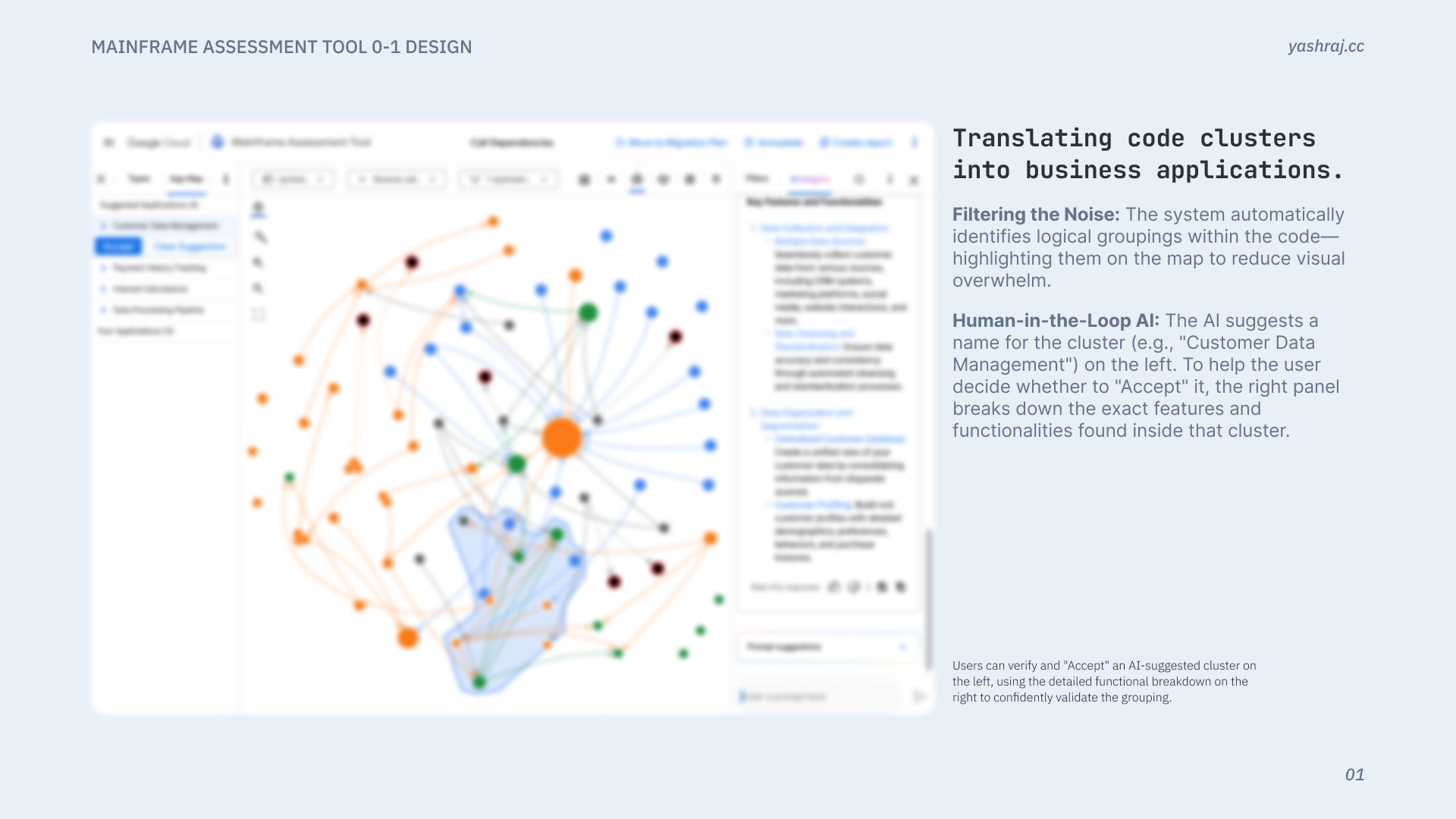
Example: code clusters → business applications
The system finds logical groupings in the code and highlights them on the map so the graph is easier to read instead of one unreadable blob—that is the “filter the noise” step. On the left, the model proposes a plain-English cluster name (for example, “Customer Data Management”); on the right, a feature-level breakdown lists what was actually found inside that cluster so you are not accepting a label blind. Accept is a deliberate step: you are turning tacit, scattered knowledge into named things everyone can point to, which builds a shared baseline of what exists before planning or migration work moves on.
Impact
Teams could point at the same plan, expand the surface without losing the plot, and unblock decisions that used to drown in complexity.
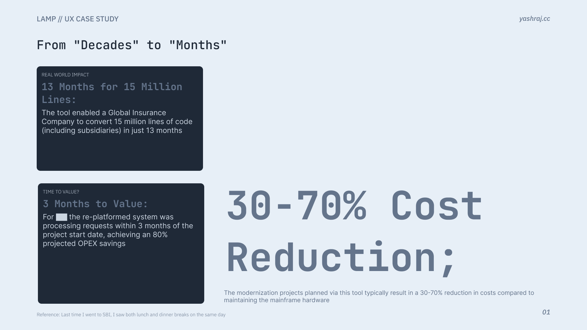
Representative impact framing (mock).
Role over this period: UX Designer II → Lead UX Designer.